Slim Slashy: A Slim Display Font for Striking Web Headlines
I was halfway through a landing page refresh for a small ceramics brand when I hit a wall with the hero title. The photography was warm and organic, the messaging felt right, but the default geometric sans serif was flattening the entire header. It needed a typeface that could hold its own against textured backdrops without screaming. That’s when I dropped Slim Slashy into the layout and saw the whole top section settle into place.
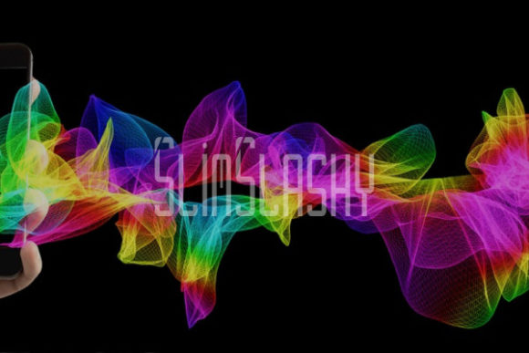
Slim Slashy isn’t just another slim typeface. The first thing you notice — beyond the airy, elongated letterforms — is that distinct horizontal slice cutting through uppercase characters. It’s a deliberate, almost editorial quirk that turns a clean sans serif into a memorable display font. That incision works almost like a focal anchor, pulling the eye through long title lines and adding a sense of rhythm without any extra graphic weight. For a digital project that lives on contrast — image-heavy backgrounds, minimal UI, generous white space — it’s the kind of visual detail that makes a brand feel curated rather than just styled.
A Design Detail That Does More Than Decorate
Many display fonts rely on exaggerated swashes or dramatic weight shifts to stand out. Slim Slashy takes a quieter approach. The overall character width is consistently slim, giving headings a tall, refined posture. The counter spaces remain open, which keeps short phrases legible even when layered directly over a busy photograph. That slash across the uppercase set — think A, B, E, H, and so on — introduces a subtle horizontal interruption that feels architectural rather than decorative. It reminds me of a restrained modern logo treatment, the kind of mark you’d see on a high-end packaging label or a gallery wall.
In practice, this means the font carries a personality that can flex between creative portfolios, boutique online stores, and even editorial-style blog headers. It reads as premium without feeling fragile, and the linear cut gives it enough edge to avoid being overly soft. That balance is hard to find in the freebies category, where many display fonts lean either too playful or too corporate.
Testing Slim Slashy in a Real Web Layout
My live test case was that ceramics shop — a responsive site with a dark terracotta hero section, layered product photography, and a brand voice that sits somewhere between artisanal warmth and minimal luxury. I set the main headline in Slim Slashy at around 4.5rem on desktop, stacked across two lines with tight but not cramped leading. The slim form didn’t compete with the busy porcelain textures behind it. Instead, the cut-through strokes echoed the handcrafted marks on the ceramics themselves. That kind of accidental visual harmony is what designers hope for when pairing type with imagery.
Below the hero, I applied Slim Slashy to section titles — “New Arrivals,” “The Studio,” “Workshops.” In smaller sizes, around 2rem, the slash detail becomes more nuanced. It still registers without distracting from the supporting product cards. For body copy and navigation, I paired it with a sturdy sans serif (Inter, in this case) set at comfortable reading sizes. The contrast worked immediately: the airy display headlines float above the grounded, utilitarian text, creating a clear two-tier hierarchy that helps users scan the page and understand content grouping intuitively.
Typography Hierarchy and Readability Across Devices
When you work with any slim display font, screen readability is the first concern. Slim Slashy holds up better than expected because its letterforms, while narrow, maintain consistent stroke weight. I tested the hero title on a standard mobile viewport, and even at around 2.2rem, the cut lines were still visible without turning into visual noise. The font’s open counters and generous default spacing meant letters didn’t merge together at smaller sizes, a common pitfall with ultra-thin typefaces.
That said, I wouldn’t use Slim Slashy for body text, product descriptions, or any running copy below 18px. Its strength is in short, high-impact phrases — hero headlines, banner text, announcement bars, or large CTA blocks. On dark backgrounds, the slim strokes can lose a bit of presence if the contrast ratio isn’t high enough. A quick check with a contrast checker and a bump to a medium weight (if the font family includes it) keeps things accessible. Over image overlays, I’ve found that adding a subtle text shadow or a semi-transparent scrim helps maintain legibility without stripping away the font’s light feel.
When previewing the site on a tablet or a smaller laptop, I noticed that the font worked especially well in landscape-oriented layouts where horizontal space allows those uppercase slashes to breathe. In narrower breakpoints, stacking the headline and increasing line-height slightly preserves the rhythm. It’s a thoughtful reminder that a display font isn’t plug-and-play — it responds to the space you give it.
Creative Applications Beyond the Hero Section
Once I had the ceramics site dialed in, I started exploring where else Slim Slashy could shine across digital projects. For a coaching website, I could see it used in value proposition banners: short, confident statements set in that slim, incisive style project a blend of modern professionalism and creative energy. A course sales page might feature it in module headers or testimonial highlight quotes, giving the content a lift without distracting from the offer details.
In a portfolio homepage, using Slim Slashy for the designer’s name or discipline tagline immediately signals a refined aesthetic. Combined with plenty of negative space, it helps a personal brand feel intentional. For an online store that sells curated home goods, product category banners get an instant upgrade — the cross-line detail adds a subtle mark of quality that typical system fonts can’t replicate. Even in digital ads and social media graphics, where you only have a second to catch attention, the unique uppercase styling creates a recognizable block of text that people start to associate with your brand.
I’ve also dropped it into a blog redesign concept, using Slim Slashy only on the featured post titles and the “About the Author” section header. That selective application prevents the site from feeling overly stylized while still giving readers a visual cue that something curated is happening. The key is restraint: a display font like this works hardest when it’s used sparingly, acting as a highlight rather than the entire visual vocabulary.
Font Pairing That Supports a Polished Brand Experience
Good web typography is as much about pairing as it is about the star typeface. For Slim Slashy, I lean toward clean, workhorse sans serifs for body copy — Inter, Open Sans, or SF Pro Text all do the job without stealing attention. They offer the neutral, highly readable foundation that lets the display font’s slim elegance stand out. If the brand leans more editorial, a light serif like Cormorant Garamond or Lora can create a sophisticated magazine-style contrast, with the sharp slice of Slim Slashy’s uppercase playing against soft serif terminals.
What I avoid is pairing Slim Slashy with another highly stylized display font. Competing personality traits confuse the visual hierarchy and can make a layout feel cluttered, even if there’s plenty of white space. Instead, I treat it as the soloist and every other type choice as the supporting ensemble. Button text, microcopy, and navigation labels stay firmly in the neutral sans serif family, preserving the clarity of interactive elements while the headings carry the expressive load.
Practical Considerations Before Using Slim Slashy in Production
Like any asset in the Freebies section, it’s important to check what you’re actually downloading and whether it fits your project’s technical needs. Slim Slashy, being a font, likely comes as a desktop file or webfont package. Before embedding it in a client site or a live online store, I always verify:
- What file formats are included — WOFF2 for modern browsers, WOFF as fallback, and occasionally EOT or SVG for legacy support.
- Whether the font offers multiple weights or just a regular cut. A single weight might be enough for display usage, but having a bold or italic variant can add expressive range.
- If multilingual character sets are supported, especially if the website serves an international audience.
- The commercial font license terms. Freebies sometimes limit usage to personal projects only, so checking the license for commercial use — especially for client work, online stores, or templates — is non-negotiable.
Most often, I serve display fonts via @font-face with a controlled subset to keep page load times fast. Because Slim Slashy is likely used in limited text strings, subsetting doesn’t hurt functionality and keeps performance snappy. Additionally, I always test how the font renders across operating systems and browsers; some display fonts can look slightly heavier on Windows depending on hinting.
For digital brand kits and style guides, I document exactly where Slim Slashy should appear — headline levels, max character count, minimum size on mobile, and fallback stack. Having those guidelines early prevents misuse and helps maintain a consistent brand identity as the site grows or passes to another designer.
Ultimately, the value in a freebie like Slim Slashy isn’t just that it costs nothing. It’s that it offers a distinctive, professional edge when applied thoughtfully. It’s the kind of typographic choice that makes a landing page feel intentionally designed rather than templated, and that small shift in perception can influence how visitors experience a brand long before they read a single word of body copy.